

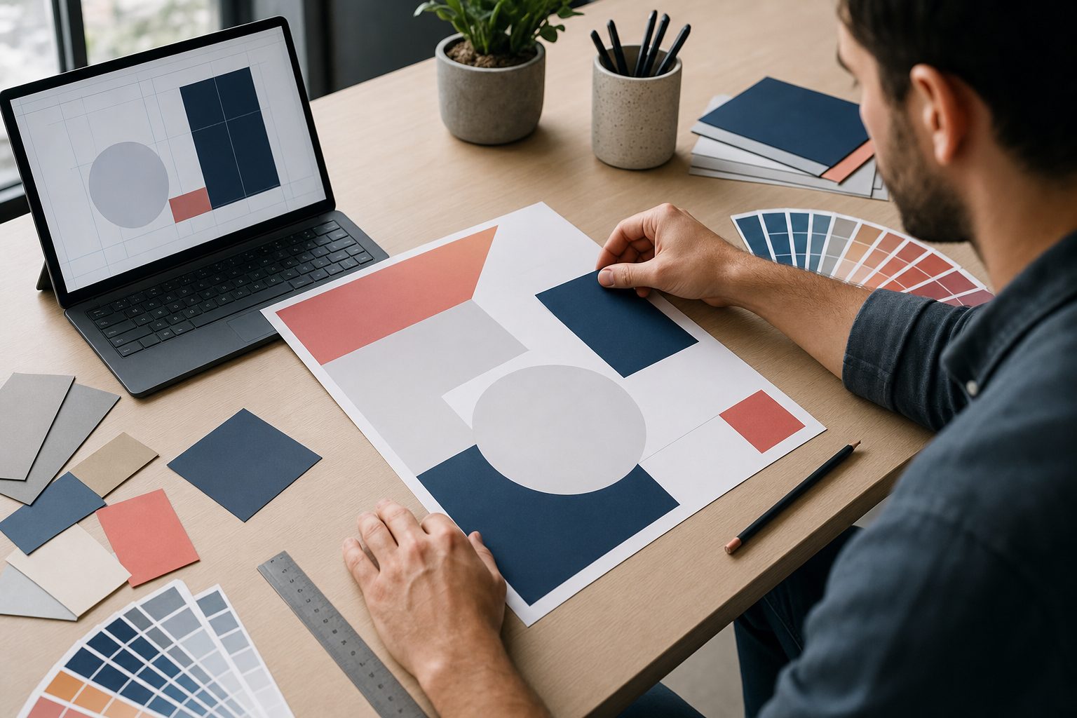
Learning how to make a flyer is one of the simplest ways to promote an event, offer, service, product, or local message without needing advanced design skills. A good flyer does more than look attractive; it quickly tells people what is happening, why it matters, and what they should do next. Whether you are creating a school notice, business promotion, real estate handout, party invitation, restaurant deal, or community announcement, the same design principles apply. You need a clear purpose, a focused message, readable text, strong visuals, and a layout that guides the eye naturally. This easy design guide walks you through the full process, from planning your flyer content to choosing colors, arranging elements, avoiding mistakes, and preparing the final design for print or digital sharing.
What A Flyer Is
A flyer is a single-page promotional or informational design used to communicate a message quickly. It can be printed, shared digitally, handed out, posted on notice boards, inserted into packages, or used as part of a local marketing campaign.
The purpose of a flyer is usually direct. It may invite people to an event, announce a sale, explain a service, promote a new business, or encourage people to take a specific action. Because people often glance at flyers quickly, every word and design choice should work hard.
A strong flyer combines design and communication. The headline attracts attention, the supporting copy explains the offer, the visuals create interest, and the call to action tells readers what to do next. When these parts work together, the flyer becomes easy to understand.
Flyers are still useful because they are flexible and affordable. Small businesses, nonprofits, schools, clubs, churches, restaurants, and event organizers can all use flyers without needing a large advertising budget or complicated marketing system.
The best flyers are not crowded or confusing. They focus on one main message and make that message easy to notice, read, remember, and act on.
Why Flyer Design Matters
Design affects how people respond to your flyer. Even a strong offer can be ignored if the flyer looks messy, hard to read, or unprofessional.
- First Impression: A polished flyer helps people trust the message before they read every detail.
- Clear Communication: Good design makes the headline, offer, date, location, and action easy to find.
- Better Attention: Strong contrast, visual hierarchy, and spacing help the flyer stand out in busy places.
- Brand Recognition: Consistent colors, fonts, and tone make your business or organization easier to remember.
- Higher Response: A clear call to action increases the chance that readers will visit, call, register, buy, or attend.
How To Make A Flyer Step By Step
The easiest way to make a flyer is to follow a clear process. These steps help you move from a rough idea to a finished design that is ready to share.
- Set The Goal: Decide what the flyer should achieve, such as event attendance, product sales, sign-ups, bookings, or general awareness.
- Define The Audience: Think about who will read it, what they care about, and what information they need first.
- Write The Main Message: Create one clear headline that explains the offer, event, or announcement in simple words.
- Add Key Details: Include the date, time, location, price, contact details, deadline, or any important conditions.
- Choose A Layout: Arrange the headline, image, body text, and call to action so the reader can scan the flyer easily.
- Select Visuals: Use photos, icons, shapes, or illustrations that support the message instead of distracting from it.
- Review The Design: Check spelling, spacing, alignment, contrast, readability, and whether the call to action is obvious.
- Prepare For Sharing: Save the flyer in the right format for printing, email, social media, or online posting.
Plan Your Flyer Message
Before designing, get the message right. A flyer with a weak message will struggle even if it looks beautiful.
1. Choose One Main Goal
Every flyer should have one main purpose. If you try to promote an event, explain every service, list multiple offers, and tell your full brand story at once, the reader may feel lost. A focused goal makes the flyer easier to write, design, and measure.
2. Write A Clear Headline
The headline is usually the first thing people see, so it should explain the main benefit or announcement quickly. Avoid vague phrases that sound clever but do not say much. A simple headline like “Summer Sale This Weekend” often works better than a complicated slogan.
3. Keep Details Useful
Include only the information readers need to take the next step. For an event flyer, that usually means the event name, date, time, location, price, and registration details. For a business flyer, it may mean the service, benefit, offer, and contact method.
4. Focus On Benefits
People respond better when they understand what they gain. Instead of only saying what you offer, explain why it matters. A fitness flyer might mention stronger energy, flexible class times, or beginner-friendly coaching, depending on what the target audience values most.
5. Use Simple Language
A flyer is not the place for long explanations or complex wording. Short sentences, familiar words, and direct instructions are easier to scan. If someone needs to read the flyer twice to understand it, the message probably needs to be simplified.
6. Add A Strong Action
Tell readers exactly what to do next. Good flyer calls to action include “Book Your Seat,” “Visit Today,” “Call To Register,” “Bring This Flyer,” or “Join Us Saturday.” The action should feel natural and match the goal of the flyer.
Choose The Right Flyer Layout
Layout controls the order in which people notice information. A clean structure helps readers move from the headline to the supporting details without confusion.
1. Start With Visual Hierarchy
Visual hierarchy means making the most important elements stand out first. The headline should usually be largest, followed by the image, key offer, details, and call to action. This order helps readers understand the flyer even when they only glance at it briefly.
2. Use Enough White Space
White space is the empty area around text and images. It does not have to be white, but it should give the design room to breathe. Without enough spacing, the flyer can feel crowded, cheap, or stressful to read.
3. Align Elements Consistently
Alignment makes a flyer look organized. Text blocks, images, buttons, and contact details should line up cleanly instead of floating randomly. Consistent alignment gives the design a professional structure and makes it easier for readers to follow the information.
4. Balance Text And Images
A flyer should not be all text or all decoration. Text gives the message, while images create interest and context. The right balance depends on the purpose, but every visual should support the message instead of filling space without meaning.
5. Make Contact Details Easy
Important details should never be hidden in tiny text at the bottom. If the reader wants to call, visit, register, or attend, they should find the needed information quickly. Keep contact details grouped together and use enough contrast to make them readable.
6. Design For The Final Size
A flyer that looks good on a large screen may not work when printed smaller or viewed on a phone. Choose the flyer size early and design with that format in mind. Always check whether text remains readable at the real viewing size.
Design Flyer Visuals
Visuals help your flyer attract attention and communicate mood. The goal is to make the message more memorable, not to decorate every empty space.
1. Pick Relevant Images
Choose images that clearly connect to the flyer topic. A food flyer should show the actual dish or a realistic food scene. An event flyer should suggest the atmosphere of the event. Relevant visuals help readers understand the message faster.
2. Use Strong Contrast
Contrast helps text stand out from the background. Dark text on a light background or light text on a dark background is usually easiest to read. Avoid placing important words over busy images unless you add enough separation behind the text.
3. Limit The Color Palette
Too many colors can make a flyer look chaotic. Use two or three main colors, then add one accent color for emphasis. The colors should match the message, audience, and brand while still providing enough contrast for easy reading.
4. Choose Readable Fonts
Decorative fonts can work for a headline, but they should be used carefully. Body text needs to be simple and readable. Most flyers look better with one or two font families instead of several unrelated styles competing for attention.
5. Use Icons With Purpose
Icons can help organize details such as time, location, phone number, or price. They are useful when they make information easier to scan. Avoid using random icons only because they look nice, especially if they do not add meaning.
6. Keep Branding Consistent
If the flyer represents a business or organization, use the same colors, logo style, and tone found in other materials. Consistent branding makes the flyer feel connected to the larger identity and helps people recognize the sender more easily.
Examples Of Flyer Design Ideas
Examples can make flyer planning easier because different goals need different design choices. Use these ideas as practical starting points.
1. Event Flyer
An event flyer should make the event name, date, time, and location obvious. The design should reflect the mood, whether it is formal, fun, creative, or family-friendly. Add a clear registration or attendance action so interested readers know what to do next.
2. Business Promotion Flyer
A business flyer should focus on a specific service, product, or offer instead of listing everything the company does. A strong headline, short benefit-focused copy, and simple contact section can help turn casual readers into leads or customers.
3. Restaurant Flyer
A restaurant flyer works best when the food is visually appealing and the offer is easy to understand. Feature one main dish, menu deal, delivery option, or limited-time promotion. Avoid crowding the flyer with too many menu items at once.
4. Real Estate Flyer
A real estate flyer should highlight the property, price range, location, key features, and agent contact details. Strong photos matter because buyers often judge interest visually first. Keep the layout clean so the property information feels trustworthy and easy to compare.
5. School Flyer
A school flyer should be simple, friendly, and clear for parents, students, or staff. Important dates, required materials, location, and contact information should be easy to find. Avoid overly playful design if the information is official or time-sensitive.
6. Nonprofit Flyer
A nonprofit flyer should connect the cause to a clear action, such as donating, volunteering, attending, or sharing information. Use sincere language, relevant images, and specific details about impact. Readers should quickly understand both the need and how they can help.
Common Flyer Design Mistakes To Avoid
Small mistakes can make a flyer harder to read or less persuasive. Avoiding these problems can immediately improve your design.
1. Adding Too Much Text
Too much text makes a flyer feel like a document instead of a quick message. Readers may skip it if they cannot find the main point right away. Cut anything that does not support the goal, and move extra details to a later conversation.
2. Using Weak Headlines
A weak headline fails to tell readers why they should care. Generic phrases like “Special Announcement” or “Great Opportunity” are less useful than specific wording. Make the headline direct enough that people understand the offer without reading the entire flyer.
3. Choosing Hard To Read Fonts
Fonts that are too thin, decorative, small, or crowded can ruin an otherwise good flyer. Readers should not have to work hard to understand the message. Use stylish fonts sparingly and keep important details in a clean, readable typeface.
4. Ignoring Print Quality
A design that looks fine on screen can print poorly if images are low quality or colors are too dull. Check resolution, margins, bleed, and final size before printing. A blurry or cropped flyer can make the message look careless.
5. Hiding The Call To Action
If readers like the flyer but cannot tell what to do next, the design has failed. The call to action should be visible, specific, and easy to follow. Place it where the eye naturally lands after the main message.
6. Forgetting Proofreading
Spelling errors, wrong dates, incorrect phone numbers, and missing locations can damage trust quickly. Always review the flyer slowly before sharing it. It also helps to ask another person to check the details because fresh eyes often catch simple mistakes.
Best Practices For Flyer Design
Once the basics are in place, a few expert habits can make your flyer cleaner, stronger, and more effective.
1. Design For Fast Scanning
Most people will not read a flyer from top to bottom at first. They scan for the headline, image, offer, and next step. Use clear sections, short copy, and strong contrast so the key message can be understood in seconds.
2. Put The Best Detail First
Lead with the strongest reason to care. That might be a discount, event name, problem solved, limited deadline, or unique benefit. If the best detail is buried halfway down the flyer, many readers may never notice it.
3. Use Consistent Spacing
Spacing should feel intentional across the whole design. Similar elements should have similar distance between them, and related details should be grouped together. Consistent spacing makes the flyer easier to read and gives the layout a more professional finish.
4. Test The Flyer At Real Size
Before printing or posting, view the flyer at the size people will actually see it. A design may look balanced when zoomed in but become unreadable when printed small. Testing at real size helps you fix problems before distribution.
5. Match Style To Audience
A flyer for a children’s event can feel bright and playful, while a legal service flyer should feel calm and professional. Design choices should match what the audience expects and trusts. Style is not just decoration; it shapes response.
6. Keep The Final Action Simple
The easier the action, the more likely people are to take it. Asking readers to call, scan, visit, register, or bring the flyer should feel clear and realistic. Avoid giving too many options unless each one serves a distinct purpose.
Flyer Design Checklist
Use this checklist before printing or sharing your flyer. It helps catch common issues while the design can still be improved.
- Main Message: Confirm that the headline explains the flyer purpose quickly and clearly.
- Key Details: Check the date, time, location, price, contact details, and offer conditions.
- Readability: Make sure text size, contrast, spacing, and font choices are easy to read.
- Visual Quality: Review images, icons, colors, and branding for a clean and consistent look.
- Call To Action: Ensure the next step is visible, specific, and simple for readers to follow.
Advanced Flyer Design Tips
After you know the basics, these advanced tips can help your flyer feel more strategic and improve response.
1. Use One Focal Point
A strong flyer usually has one clear focal point, such as a headline, product image, event name, or offer. When several elements fight for attention, the reader may not know where to look first. Choose the main focus and build around it.
2. Create Message Contrast
Contrast is not only visual. Your wording should also separate the main promise from the supporting details. Make the offer, event, or benefit stand apart from secondary information so readers can quickly identify what matters most.
3. Add Urgency Carefully
Urgency can improve response when it is honest and specific. Deadlines, limited seats, seasonal offers, or one-day events give readers a reason to act sooner. Avoid fake urgency because it can reduce trust and weaken future promotions.
4. Design For Multiple Channels
If the flyer will be printed and shared digitally, plan for both formats. Printed flyers need readable margins and strong resolution. Digital flyers need clear text on small screens. A flexible design saves time and keeps the message consistent.
5. Compare Two Versions
When possible, create two versions with different headlines, images, or calls to action. Comparing responses can teach you what your audience notices. Even simple testing helps improve future flyer design decisions based on real behavior.
6. Remove One Extra Element
Before finalizing, look for one thing you can remove without hurting the message. It may be an extra icon, a repeated phrase, a weak sentence, or an unnecessary color. Simple flyers often feel more confident and are easier to remember.
Frequently Asked Questions
1. What Should A Flyer Include?
A flyer should include a clear headline, short supporting message, important details, relevant visuals, branding if needed, and a specific call to action. Depending on the purpose, it may also include a date, time, location, price, offer, contact method, or registration instruction.
2. What Is The Best Size For A Flyer?
The best flyer size depends on how it will be used. Standard letter size works well for posters and handouts, while smaller sizes are useful for street distribution, packages, counters, or mailers. Choose a size that gives your message enough room without wasting space.
3. How Many Fonts Should I Use On A Flyer?
Most flyers work best with one or two font families. Use one font for headlines and another simple font for body text if needed. Too many fonts can make the flyer look messy, while consistent typography helps the design feel professional and easier to read.
4. Can I Make A Flyer Without Design Experience?
Yes, you can make a good flyer without design experience if you follow basic principles. Start with one goal, write a direct headline, use readable text, choose a clean layout, add relevant visuals, and review everything carefully before sharing or printing.
5. What Makes A Flyer Effective?
An effective flyer is clear, focused, attractive, and action-oriented. It catches attention quickly, explains the main message in simple language, provides the necessary details, and tells readers what to do next. Good spacing, contrast, and visual hierarchy also improve results.
6. Should A Flyer Be Printed Or Digital?
A flyer can be printed, digital, or both. Printed flyers are useful for local promotion, events, counters, mailboxes, and community boards. Digital flyers work well for email, social media, and messaging. The best choice depends on where your audience is most likely to see it.
Conclusion
Making a flyer becomes much easier when you start with a clear goal and build every design choice around that goal. A strong flyer uses a focused message, readable layout, relevant visuals, simple wording, and a clear call to action.
Whether you are promoting an event, business, offer, service, or community message, the best approach is to keep the design practical and easy to scan. Plan carefully, review the details, avoid clutter, and create a flyer that helps readers know exactly what to do next.