

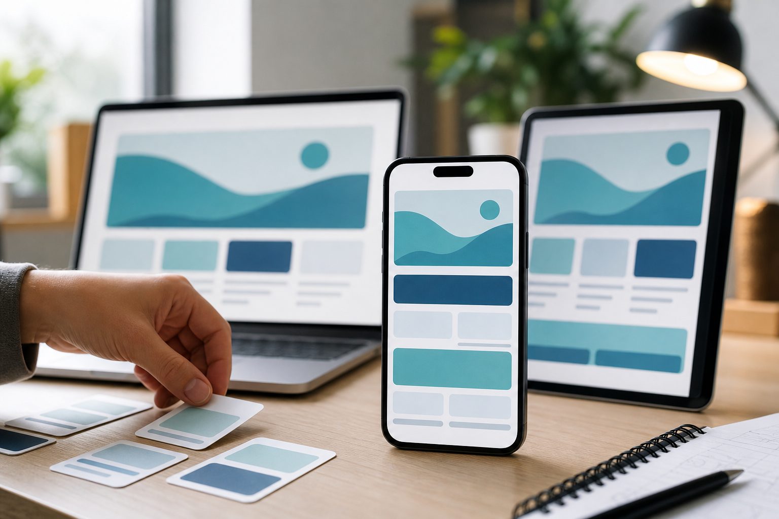
To learn how to make a website mobile friendly, start by thinking about how real people use the internet today. Many visitors arrive from phones, move quickly, scan pages, tap with their thumbs, and leave fast if a page feels slow or hard to use. A mobile-friendly website adapts to smaller screens, loads quickly, keeps text readable, and makes every action simple. This matters for user experience, search visibility, conversions, and brand trust. Whether you run a blog, local business site, online store, portfolio, or service website, mobile usability is no longer optional. In this guide, you will learn what mobile-friendly design means, why it matters, how to improve your site step by step, which mistakes to avoid, and how to test your pages before visitors find problems.
What Mobile Friendly Website Design Means
A mobile-friendly website is built so people can browse, read, click, buy, contact, and navigate comfortably on phones and tablets without pinching, zooming, or struggling with broken layouts.
1. Responsive Layouts
A responsive layout automatically adjusts to different screen sizes. Instead of creating one rigid desktop page, the design uses flexible columns, images, and spacing so content fits phones, tablets, laptops, and large screens naturally.
2. Readable Text
Mobile users should be able to read your content without zooming in. Good mobile typography uses clear fonts, comfortable line spacing, strong contrast, and text sizes that work well on small screens.
3. Easy Navigation
Mobile navigation should be simple and predictable. Menus, buttons, search bars, and important links need enough space for tapping, and visitors should always know where to go next.
4. Fast Loading Pages
Speed is a core part of mobile friendliness. Phones often rely on slower connections, so heavy images, bloated scripts, and unnecessary design elements can quickly make a website frustrating.
5. Touch Friendly Buttons
Mobile visitors use fingers, not a mouse pointer. Buttons and links must be large enough, spaced properly, and placed where users can tap them without hitting the wrong element.
6. Simple Content Flow
Mobile screens show less information at once, so content should be arranged in a clear order. The most important message, action, or information should appear early and remain easy to find.
Why Mobile Friendly Websites Matter
Making your website mobile friendly improves how people experience your brand and how search engines evaluate your pages. It affects traffic, engagement, leads, sales, and long-term trust.
1. Better User Experience
Visitors stay longer when a website feels easy to use. If text is readable, buttons are clear, and pages load quickly, users can focus on your content instead of fighting the design.
2. Higher Search Visibility
Search engines care about mobile usability because most searches happen on mobile devices. A mobile-friendly website is easier for search engines to crawl, evaluate, and recommend to users.
3. More Conversions
Mobile-friendly pages reduce friction during important actions. Contact forms, checkout pages, booking tools, and call buttons work better when users can complete tasks without confusion or delay.
4. Lower Bounce Rates
People often leave websites that are slow, cluttered, or hard to read on a phone. Improving mobile usability helps visitors stay, explore more pages, and engage with your content.
5. Stronger Brand Trust
A poor mobile experience can make a business feel outdated or unreliable. A clean, fast, and helpful mobile site gives visitors confidence that your company pays attention to details.
6. Better Local Search Results
Many local searches happen on mobile devices when people need quick answers. A mobile-friendly site makes it easier for nearby customers to call, find directions, read services, or request help.
How To Make A Website Mobile Friendly Step By Step
The best way to make a website mobile friendly is to improve structure, speed, usability, and content together. These steps help you fix the most important areas first.
- Check Your Current Mobile Experience: Open your website on several phones and review every important page. Look for small text, awkward menus, slow loading, broken images, forms that are hard to complete, and content that feels crowded.
- Use A Responsive Design: Choose a theme, framework, or layout system that adapts to different screen sizes. Avoid fixed-width designs because they often create horizontal scrolling and unreadable content on phones.
- Simplify Your Navigation: Keep mobile menus short and focused. Put the most important pages first, remove unnecessary options, and make sure visitors can reach key actions in a few taps.
- Optimize Images: Compress large images, use appropriate dimensions, and avoid uploading desktop-sized visuals when smaller versions work better. Image optimization often creates one of the fastest mobile speed improvements.
- Improve Page Speed: Reduce unnecessary scripts, remove unused plugins, enable caching where appropriate, and keep pages lightweight. A faster website improves both usability and search performance.
- Make Forms Easier: Ask only for necessary information, use clear labels, and make fields large enough to tap. Long or confusing forms are especially difficult on small screens.
- Test Before Publishing: Review changes on multiple devices and screen sizes. Test menus, buttons, forms, checkout flows, videos, popups, and images so problems are found before users experience them.
Key Mobile Friendly Website Factors
Several technical and design factors decide whether your website works well on mobile. Pay attention to these areas because they directly shape usability and performance.
- Viewport Settings: Your site should tell browsers how to scale content properly on different devices.
- Flexible Images: Images should resize within their containers instead of overflowing or forcing horizontal scrolling.
- Readable Font Sizes: Body text, headings, labels, and buttons should remain comfortable to read on small screens.
- Tap Target Spacing: Buttons, links, and form controls need enough room so visitors can tap accurately.
- Fast Server Response: Even a well-designed page feels slow if hosting, caching, or backend performance is weak.
- Clean Content Structure: Short sections, clear headings, and logical order help mobile users scan and understand quickly.
Mobile Friendly Design Best Practices
Good mobile design is not just about shrinking a desktop website. It means designing for smaller screens, shorter attention spans, and touch-based behavior from the beginning.
1. Design For The Smallest Screen First
Starting with mobile forces you to focus on what matters most. Once the small-screen version works well, you can expand the design for tablets and desktops without adding unnecessary clutter.
2. Keep Menus Short
A mobile menu should help users make quick decisions. Too many navigation items can overwhelm visitors, especially when they are browsing with one hand or looking for urgent information.
3. Use Clear Calls To Action
Buttons should tell people exactly what will happen next. Labels such as call now, book appointment, get quote, or view pricing are easier to act on than vague wording.
4. Avoid Intrusive Popups
Popups can be especially annoying on mobile screens. If you use them, keep them easy to close, avoid covering important content, and never block users from completing key actions.
5. Prioritize Important Content
Mobile visitors should not have to scroll through long introductions before finding value. Place essential information, benefits, contact options, or product details near the top of the page.
6. Maintain Visual Consistency
Colors, spacing, buttons, headings, and forms should feel consistent across mobile pages. Consistency reduces confusion and makes your website feel more professional and easier to trust.
Common Mobile Friendly Website Mistakes To Avoid
Many websites lose mobile visitors because of small issues that compound into a frustrating experience. Avoiding these mistakes can quickly improve usability and performance.
1. Using Fixed Width Layouts
Fixed layouts often break on smaller screens and force users to scroll sideways. A flexible layout is essential because mobile devices vary widely in size, resolution, and orientation.
2. Uploading Oversized Images
Large images can make mobile pages painfully slow. Compress images before uploading, use the right dimensions, and avoid using high-resolution files when they provide no visible benefit on phones.
3. Making Buttons Too Small
Tiny buttons lead to tapping errors and frustration. Important actions should have enough height, width, and spacing so users can complete tasks easily with their thumbs.
4. Hiding Important Information
Some mobile designs remove key details to save space. This can hurt conversions if visitors cannot find prices, contact details, product information, service areas, or trust signals.
5. Ignoring Forms
Forms that work on desktop may feel difficult on mobile. Long fields, unclear labels, small checkboxes, and unnecessary questions can cause users to abandon the process.
6. Testing Only On Desktop
Desktop previews do not reveal every mobile problem. Real devices show issues with tapping, scrolling, keyboard behavior, orientation changes, and loading speed that previews may miss.
Examples Of Mobile Friendly Website Improvements
Practical examples make it easier to see what mobile optimization looks like in real situations. These improvements apply to many websites, from blogs to ecommerce stores.
1. A Local Service Website
A plumber, dentist, or contractor can improve mobile results by placing call buttons, service areas, reviews, and appointment forms near the top. Mobile visitors often want quick action, not long explanations.
2. An Online Store
An ecommerce site should make product images clear, filters easy to use, and checkout simple. Fewer steps, faster loading, and mobile payment options can reduce abandoned carts significantly.
3. A Blog Or Publisher Site
A blog needs readable text, clear headings, compressed images, and minimal interruptions. Mobile readers often scan first, so strong structure helps them decide whether to keep reading.
4. A Restaurant Website
A restaurant should make menus, hours, location, reservations, and call buttons easy to find. Many users visit from phones while deciding where to eat or how to order.
5. A Portfolio Website
A portfolio should present work samples without slowing the page. Images need to be optimized, project descriptions should be concise, and contact options should remain visible and simple.
6. A Software Website
A software company should explain value quickly, show product screens clearly, and make demos or signups easy. Complex feature tables may need simplified mobile layouts for better readability.
Mobile Friendly Content Tips
Content plays a major role in mobile usability. Even a responsive layout can feel hard to use if the writing is dense, poorly structured, or difficult to scan.
Write shorter paragraphs because mobile screens make long blocks of text look heavier. A paragraph that seems normal on desktop can feel overwhelming on a phone, especially when users are multitasking or comparing options.
Use descriptive headings that tell readers what each section covers. Clear headings help people scan quickly, find answers, and return to important parts without rereading the entire page.
Place the most useful information early. Mobile users often want quick answers, so explain the main point before adding background details, examples, or supporting information.
Break complex ideas into smaller sections. This makes your website easier to read and also helps search engines understand the structure and purpose of your content.
Keep calls to action clear and natural. A mobile visitor should always know the next useful step, whether that is calling, reading more, booking, buying, or requesting information.
Advanced Mobile Website Optimization Tips
Once the basics are working, advanced improvements can make your mobile website faster, smoother, and more competitive in search results and user experience.
1. Improve Core Web Vitals
Core Web Vitals measure loading speed, responsiveness, and layout stability. Improving these signals helps create a smoother experience, especially for mobile users on slower devices or weaker connections.
2. Reduce Layout Shifts
Unexpected movement is frustrating on phones. Set image sizes, reserve space for ads or embeds, and avoid loading elements that push content down after users begin reading.
3. Use Lazy Loading Carefully
Lazy loading can improve speed by delaying off-screen images. However, important above-the-fold content should load quickly so visitors do not see blank areas when the page opens.
4. Simplify Tracking Scripts
Analytics, ads, chat widgets, and marketing scripts can slow mobile pages. Review which scripts are truly necessary and remove tools that add weight without clear business value.
5. Optimize Mobile Search Intent
Mobile users may search differently from desktop users. They often want quick comparisons, directions, prices, reviews, availability, or immediate answers, so shape page content around those needs.
6. Review Mobile Conversion Paths
Follow the full journey from landing page to conversion on a phone. If any step feels slow, confusing, or unnecessary, simplify it before spending more money on traffic.
Mobile Friendly Website Testing Checklist
Testing helps you confirm that your improvements work for real users. Use this checklist before publishing new pages or redesigning important parts of your site.
- Check Multiple Devices: Review pages on different phone sizes, tablets, and desktop screens to catch layout problems.
- Test Navigation: Open menus, search tools, dropdowns, and buttons to make sure every interaction works smoothly.
- Review Forms: Submit contact, checkout, signup, and booking forms from a phone to find friction.
- Measure Speed: Test load times and identify heavy files, scripts, or design elements that slow pages down.
- Check Readability: Make sure headings, body text, labels, and buttons are easy to read without zooming.
- Inspect Key Actions: Confirm that calls, purchases, downloads, reservations, and quote requests work without errors.
Frequently Asked Questions
1. What Is The Easiest Way To Make A Website Mobile Friendly?
The easiest way is to use a responsive website design, compress images, simplify navigation, and test important pages on real phones. Start with the pages that bring the most traffic or conversions because fixing those first usually creates the biggest improvement.
2. How Do I Know If My Website Is Mobile Friendly?
You can check manually by opening your website on several mobile devices and reviewing readability, speed, buttons, menus, forms, and layout. If users must zoom, scroll sideways, or wait too long, the site needs mobile improvements.
3. Does Mobile Friendly Design Help SEO?
Yes, mobile-friendly design can support SEO because search engines want to show pages that work well for users. Better speed, clearer structure, easier navigation, and stronger engagement can all help your website perform better in search.
4. Is Responsive Design Better Than A Separate Mobile Site?
Responsive design is usually better for most websites because one version adapts to different devices. Separate mobile sites can create duplicate content, maintenance issues, and inconsistent experiences unless they are managed very carefully.
5. Why Is My Website Slow On Mobile?
Common causes include large images, too many plugins, heavy scripts, weak hosting, unoptimized code, and third-party tools such as ads or chat widgets. Mobile speed often improves when you reduce page weight and load only what users need.
6. How Often Should I Test My Mobile Website?
Test your mobile website whenever you publish major pages, change your design, add plugins, update forms, or launch campaigns. A full review every few months is also helpful because devices, browsers, and user expectations continue to change.
Conclusion
Making a website mobile friendly means creating a fast, readable, responsive, and easy-to-use experience for visitors on phones and tablets. The most important improvements include responsive layouts, clear navigation, optimized images, touch-friendly buttons, simple forms, and regular testing.
A strong mobile website helps users find information faster, trust your brand, and take action with less effort. Start with the biggest usability problems first, then keep refining speed, content, and conversion paths as your website grows.